Life in Lyon project
Réalisé dans le cadre de ma formation Ducci 1 |anglais
The aim is to propose something attractive for international students who came from different cultures.
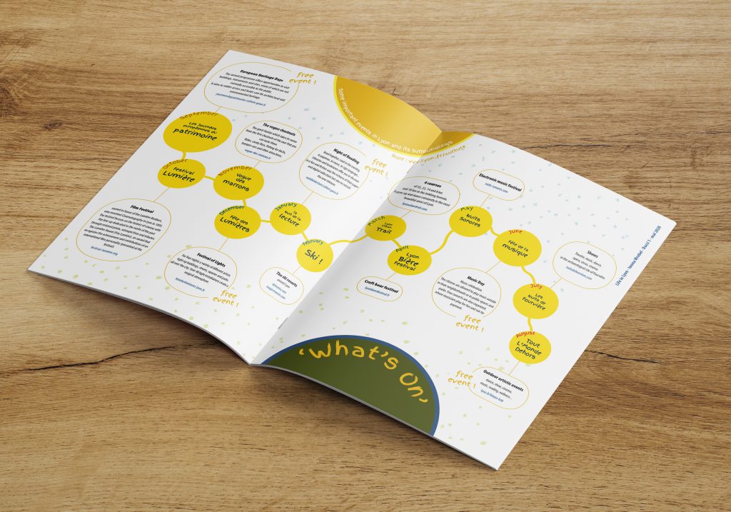
By using a timeline, I present some important events in Lyon and its surroundings. I propose one event per month and explain it with a zoom. It looks like a curvy line with 12 circles including months from September to August and the real French name of the event. The blocks of text include a brief overview and a website address.
My infographic contains a lot of elements, so I decided not to include additional illustrations, to ensure good visibility. Each event has a different character and is worth being discovered. I placed the small dots in the background. It could be rain, snow, grass… or just a graphic pattern.
I choose bright colours for the treatment. For a long time the colour yellow was hated in the Occident, today it is appreciated for its vitality. I use « sunshine » yellow for the joy and optimism it brings. I add friendly orange, trustful blue and peaceful green. I like the harmony of this palette. To represent the seasons, I have written the summer months in red, autumn in brown, winter in blue and spring in green.
If the eye first perceives the colour, it is proof that the form prevails over the text.
The round, primary abstract form, evokes infinity. This simple and universal form is dynamic, just as the city of Lyon is 😉
Regarding the typography, for the fact boxes, I use « Myriad Pro » which has a lot of styles (Condensed, Black, Bold, Light, etc…). For the headlines and sub headlines, I have chosen Google Font « Finger Paint ». I play with the form using curvilinear text.
This is life in Lyon before Covid-19. Today, most of the events have been cancelled. I hope next year will be better, and my infographics will be accurate…
